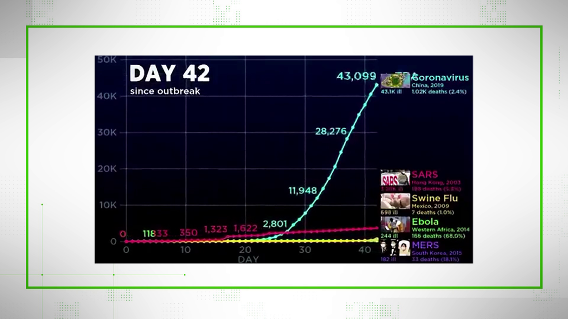
A 40-second video clip has been going viral by showing how coronavirus compares to other infamous illnesses, but what's being shared thousands of times leaves out some key context.
The animation in questions compares the new coronavirus, named COVID-19, to other major viruses from the early 21st century including SARS, MERS, Ebola and swine flu (H1N1).
The graph starts at "Day 1" of the initial outbreak and as the video moves forward, the chart tracks shows the number of people infected over the same time period.
In the first 20 days, SARS takes a dominant lead, but then by day 42,coronavirus has taken such a drastic lead that the other lines can barely be seen. That's where the viral video ends.
THE QUESTION
Is this video an accurate portrayal of how infectious these viruses were? Is the coronavirus really as infectious as the video portrays?
THE ANSWER
The 40-second clip does use accurate and reputable data to make a visual representation of the spread of these viruses over time.
Compared to those other four, COVID-19 is significantly more infectious at the 42 day mark.
However, the clip on Twitter was actually taken from a longer video on Youtube, which showed that swine flu actually spread much further.
SOURCES
WHAT WE FOUND
The numbers in the video are accurate for the date it was posted. At the time the video was posted, the new Coronavirus had infected more than 43,000 people worldwide. The latest WHO estimate is closer to 82,000.
The charts accurately reflect the data from the CDC and WHO on the infection rates of the coronavirus, SARS, MERS, Ebola and H1N1 (swine flu).
What does that mean? The current coronavirus is infecting more people at a faster rate than any of those other viruses had at this point in those outbreaks.
But the 40-second clip on twitter is missing important context.
We tracked down the original source of the clip to a 10-minute youtube video.
If you play beyond the 40-seconds from the viral clip, you’ll see that as you get into the hundreds of days on the chart, swine flu takes over and eventually reaches up to 60 million infected.


The original video was actually trying to show that coronavirus isn’t the worst - at least not yet.
Bottom line: We can VERIFY this video is true and that the numbers are accurate and come from reputable sources.
But the video doesn’t show the whole story and THAT context is key.
For instance - This chart shows how infectious these viruses are - not how fatal.
The coronavirus is the most infectious at this point, but it also has the second-lowest fatality rate. Only the swine flu had a lower rate - while SARS, MERS, and Ebola were much more deadly.
Giving important context may take more time than a 40-second viral clip - but it can help make sure that we’re all focusing on facts, not fear.
Something you’d like VERIFIED? Click here to submit your story

